In today's lesson our task was to create a film poster. We were given a camera and told to take pictures on campus. We had to think a lot about Mise En Scene and how to create the desired effect we wanted on our audience.
My partner and I decided to make a poster for the 'horror' genre of film. We tested different locations to see what was suitable for this theme and experimented a lot with camera angles. We also thought a lot about body language and what impression this might give the audience.
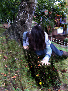
 Considering we wanted a horror/thriller approach for our poster, we thought that it would be best to have a tilted camera shot to create an un-easy feeling. However we couldn't find a good angle to work with, so instead took a picture on a hill that was slanted - which still gave an unsettled perception. Also notice that my head and hair are the centre pull of focus. This is where we used the idea of 'The Rule of Thirds'.
 Here you can see the original image and the edited version of the picture we took. We edited the second picture using Photoshop software. I covered my hair over my face to create a mysterious and uncanny look. I also thought a lot about my physicality and
what kind of posture I should adopt.

No comments:
Post a Comment