There is very good annotated decision making in relation to your digipak; I would have liked to have seen more. Evident decision making and I like the video diary footage that is appearing on your blog. Excellent effort, Well Done.
Saturday, 26 November 2011
Video Editing Process
Here you can see Honey and I beginning the editing process through 'logging' and naming our shots.
Wednesday, 23 November 2011
Sizes and Fonts of Digipack Cover
Technology and process involved
We used Photoshop software to create our digipak covers. We were given a digital CD pack template and digitally edited our photos over the template covers.
We measured the template sizes in centimeters, length by width, and cropped the pictures we took from our shoot day onto our digipak template.
Vlad and I worked together on the placing of font, style of font and text placing that we thought would work. We used a font from a website called 'Fontspace' to create 'Dummy's' logo signature.
We used Photoshop software to create our digipak covers. We were given a digital CD pack template and digitally edited our photos over the template covers.
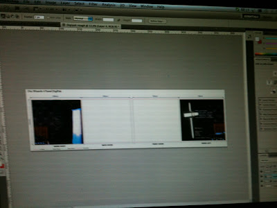 |
| Placing our photos over the digipak template. |
We measured the template sizes in centimeters, length by width, and cropped the pictures we took from our shoot day onto our digipak template.
Vlad and I worked together on the placing of font, style of font and text placing that we thought would work. We used a font from a website called 'Fontspace' to create 'Dummy's' logo signature.
I chose this font with Vlad because it has a classic look about it, just as Dummy has her classy, sexy image. However there is something dark and edgy about the font here with the smudging and blotted ink which subconsciously tells the consumer that something is not quite right..
Sunday, 20 November 2011
Saturday, 19 November 2011
Feedback
Excellent diary entry of the shoot day - reflective upon decision making and links to actual media practice. More could have been said on lighting and set design - identify the effect and technology used. Do fully reflect on the shot selection and the image you wanted to create for marketing of the band.
Wednesday, 16 November 2011
Evaluation of shoot day
9:00am-9:45am
We spent the first 45 mins sorting out my costume, hair and make-up. We then planned what scenes we were going to shoot first and when we would film the bathroom scenes.
9:45am-12:30pm
I discussed with Sophie and Honey how I was going to perform 'Dummy' in her role. I wanted to portray a disturbed and dark nature for her star persona, and so her style would also suit the music style. Sophie and Honey helped to direct me, but it was fair to say I mostly directed myself as I improvised the performance on the day.
During the shoot, however, I subconsciously presented a more erotic image for the star. But because the lighting was very low key and the wallpaper and mise en scéne of the bedroom very sleazy - this added another element to Dummy's 'personality' that worked well.
The lighting we chose to use was a mix of warm yellow, with some pale blue. The warm yellow gave a warmth to the room, indicating it was dark outside and giving the impression of lamp lighting in the room.The warm lighting colour was used in the 'memory shot' scenes where the couple are happy and toasting together. Though we used a mix of yellow and blue lighting in the present day performance shots. The yellow created a sense of realism along with the underlying blue tones which gave a sense that there was not something quite right with the character.
We decided to get all my bedroom scenes done first. A sequence and selection of mid-shots, close up shots and wide shots were taken of my performance in the bedroom scenes.
Mid-Shots
These helped to show both my facial expression and body language reading.
Close-Up Shots
Helped to define and focus solely on the expression my character gave.
Wide Shots
These gave a general view and mise en scéne of the room.
Crane Shots
We used some crane shots filming above the bed
to get a more male perspective of the singer, appealing to the target audience.
Tracking Shots
We also experimented with tracking shots - for example, we use a tracking shot above the bed as the camera moves up and away from me. This gives the audience distance from the character, implying she is dangerous.
We also ended up ad-libing a lot of shots because our storyboard had not worked out as well as we had hoped. If i'm honest - we hadn't completed it to our satisfaction due to lack of preparation time and planning!
1:20pm-6:00pm
We continued for an hour on specific sections of shooting. For example, we shot some images of my hands, and sections of my body as the camera moved up me. The 'random' body and hand shots enhanced the sexual nature to 'Dummy'. These shots had been decided on the spur of the moment because I had created a more erotic persona for the singer. We also added a pull focus shot from one eye to the other and then we decided to film some downward crane shots of me on the bed.
After this hour, we brought Walter in to work with us. I got changed into my second costume, and we prepared to set up for our second batch of shoots.
Walter and I had screen tested our kissing shots the day before, so that there would be no awkwardness on the day and we could get on with the scene. I helped to direct Walter in his acting, and I suppose had the most influence on his performance because we had to work off each other.
The scenes we shot between Walter and I were very much improvised, although we did try to keep to the original storyboard shots.
Added extra scenes with Walter
Importance of my performance - acting for a specific target audience
I was disappointed I hadn't been able to film any shots myself as I was relied upon to perform, but I did direct many of my own scenes. For example, I had the task of making sure that the star image of our artist came across and I was delivering to the right target audience - aiming more for 18+ male based audience (appeal with violent sexual scenes, erotic image of artist and the suggestive mise en scéne shots).
I also came up with the setting and design for our video and chose the song!
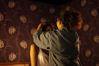 |
| Honey helping me with my wild hair! |
9:45am-12:30pm
I discussed with Sophie and Honey how I was going to perform 'Dummy' in her role. I wanted to portray a disturbed and dark nature for her star persona, and so her style would also suit the music style. Sophie and Honey helped to direct me, but it was fair to say I mostly directed myself as I improvised the performance on the day.
During the shoot, however, I subconsciously presented a more erotic image for the star. But because the lighting was very low key and the wallpaper and mise en scéne of the bedroom very sleazy - this added another element to Dummy's 'personality' that worked well.
The lighting we chose to use was a mix of warm yellow, with some pale blue. The warm yellow gave a warmth to the room, indicating it was dark outside and giving the impression of lamp lighting in the room.The warm lighting colour was used in the 'memory shot' scenes where the couple are happy and toasting together. Though we used a mix of yellow and blue lighting in the present day performance shots. The yellow created a sense of realism along with the underlying blue tones which gave a sense that there was not something quite right with the character.
We decided to get all my bedroom scenes done first. A sequence and selection of mid-shots, close up shots and wide shots were taken of my performance in the bedroom scenes.
Mid-Shots
These helped to show both my facial expression and body language reading.
Close-Up Shots
Helped to define and focus solely on the expression my character gave.
Wide Shots
These gave a general view and mise en scéne of the room.
Crane Shots
We used some crane shots filming above the bed
to get a more male perspective of the singer, appealing to the target audience.
 |
| Filming one of our 'crane' shots, as the camera moves up from bed |
We also experimented with tracking shots - for example, we use a tracking shot above the bed as the camera moves up and away from me. This gives the audience distance from the character, implying she is dangerous.
We also ended up ad-libing a lot of shots because our storyboard had not worked out as well as we had hoped. If i'm honest - we hadn't completed it to our satisfaction due to lack of preparation time and planning!
1:20pm-6:00pm
We continued for an hour on specific sections of shooting. For example, we shot some images of my hands, and sections of my body as the camera moved up me. The 'random' body and hand shots enhanced the sexual nature to 'Dummy'. These shots had been decided on the spur of the moment because I had created a more erotic persona for the singer. We also added a pull focus shot from one eye to the other and then we decided to film some downward crane shots of me on the bed.
 |
| Going in for a smooch..? |
Walter and I had screen tested our kissing shots the day before, so that there would be no awkwardness on the day and we could get on with the scene. I helped to direct Walter in his acting, and I suppose had the most influence on his performance because we had to work off each other.
The scenes we shot between Walter and I were very much improvised, although we did try to keep to the original storyboard shots.
Added extra scenes with Walter
 |
| Ad-libing an argument with Walter! |
- The couple are holding each other intimately and 'Dummy' is about to kiss her boyfriend, when he chucks her violently onto the bed to suggest possible rape or just general aggressive behavior. The audience can interpret it in whatever way they feel.
- A shot of 'Dummy' rushing to get ready for work as her boyfriend lies in the background smoking in bed. The rumpled bed sheets and putting on of clothes suggests the couple have just been sexually active - or she has been raped.
- Over the shot focuses on couple arguing with one another. We had to improvise words when we acted to create a more realistic 'arguing' image!
- The couple are happy together for once. They are lounging by the bed drinking red wine- the wine foreboding the boyfriend's future murder and again the reference to religion. They are laughing and having a good time.
Scenes we kept from storyboard
- The ghost of the boyfriend calling his girlfriends name haunting and tormenting her.
- Shot of him walking up from behind her and covering her mouth.
I was disappointed I hadn't been able to film any shots myself as I was relied upon to perform, but I did direct many of my own scenes. For example, I had the task of making sure that the star image of our artist came across and I was delivering to the right target audience - aiming more for 18+ male based audience (appeal with violent sexual scenes, erotic image of artist and the suggestive mise en scéne shots).
I also came up with the setting and design for our video and chose the song!
Tuesday, 15 November 2011
Friday, 21 October 2011
Feedback
Excellent post - could be developed further by an analysis of CD digipaks aand conventions and for you to discuss how this applies to you concept. Well presented work
Finalized CASTING
We have now finalized our casting decision. The girl we wanted to cast originally, Jess, unfortunately had to drop out as did our second choice, Emma. So I decided to fill in last minute!
The boyfriend we have cast in the video is Walter. Out of all the boys we thought of casting, we decided Walter and I looked best together.
The boyfriend we have cast in the video is Walter. Out of all the boys we thought of casting, we decided Walter and I looked best together.
 |
| Walter |
Wednesday, 19 October 2011
Brainstorm on Digipak Design
Portishead has a very film noir style which I like and think we could incorporate for our digipak cover. Although we are thinking of using a police report design on our CD, I still think a black and white film noir style might help bring the heavy, dark nature of the song across. It could be appealing for audiences that like this genre of music.
Layout Design
Saturday, 15 October 2011
Evaluating our Storyboard
We have now finished our storyboard and completed our animatic!
It wasn't an easy task though and it took us a while to research styles and the look/feel of our shot choices.
 |
| Storyboarding in the process, Honey and myself. |
Storyboarding involves a much more directory approach.
Click the link below to watch a presentation I created on storyboarding.
Friday, 14 October 2011
Feedback
You address the planning of your pop music video well - through the use of the animatic and set design, this is through and detailed and supported with a couple of highly proficient video diary entries. You do need to be mpore consistent with the design of your blog - at times the text is really difficult to read Do maintain links with real media practie and keep on bloggin please.
Casting
We have been researching looks and styles that we would like to incorportate for our star and actors. Honey and I went on a hunt down for some people to cast, and here are our conclusions...
The girlfriend
The girlfriend
 |
We really liked Jess and Walter together. However we thought they looked too alike, too much as if they were related, so we decided we should not match them up together. |
Thursday, 13 October 2011
Lighting and Set Design FEEDBACK
Dan didn't think the use of candles would be a good source of natural light in our video.
Reasons we shall not use candles.
- They give a warm, glowing light. We want to create a cold atmosphere.
- They won't give out much light for the video cam to pick up anyway.
Again referring back to Massive Attack's 'Risingson'. Having the lighting something like this with the window.
Here is our set design pitch layout. You can click on the picture to enlarge the image.
 |
| The chair with the window that brings in 'City' life light. The blue and green colours represent the mouldy, cold mise en scene of the flat. |
 |
| Design of bathroom. Downward shot enhancing how vulnerable the star feels. Again the green colour represents the grotty mouldy look we want. |
 |
| Run down bedroom layout design with window behind curtains. Shot makes any action clear and seen. General view of the room. |
 |
| Basic bathroom design layout sketch. This angle allows a general view of the action happening in this room. |
Wednesday, 12 October 2011
Lighting Design
We would like to use:
- blue and green lighting for our music video.
Similarly with trip hop artists other than PJ Harvey, notice how Massive Attack have the whole grotty flat idea too. Especially notice the shadows and low key lighting that is used on the men.
In the memory flashback shots where our star remembers her abusive boyfriend, I think using similar lighting will really help convey the 'monster' boyfriend lurking in the shadows.
We will be talking to our lighting and set designer, Dan, tomorrow for feedback. We will be presenting a pitch to him. Additionally we are going to use some natural light in our video from burning candles to help create a dark, eerie atmosphere.

Tuesday, 11 October 2011
Props and Costume List for Music Video
Props
Towel - When actress comes out of bath.
Mirror - Above sink in bathroom, shot when she looks at herself in mirror.
Cards- Falling cards represent the girlfriend 'gambling' for her life if she stays with abusive boyfriend.
Water Tank - Cards fall into a glass water tank, we are able to get different shots of the cards in water from different angles.
Chair and table - She sits alone in an empty space living room.
Bed - For bedroom shots.
Costume
 |
| I was inspired by Madonna's 'Like A Virgin' for the costume design of our female. |
Silk white nightdress dress
- Helps create the innocent look we want the star to have.
- Male watchers will find sex appeal to the star as the costume is made from silk material, thought to be appealing for males.
Red lipstick
- The star is in love, hence the red lipstick. However we find she has also killed her boyfriend - blood reference.
- Red lipstick, yet again, another common attraction for males.
Ruffled hair
- Our actress actually has short, pixie like hair, so this picture represents the style I would like her hair to be like. It is slightly messy - representing her 'messed up' life.
Saturday, 8 October 2011
Editing Storyboard Process
Watch the video clip to see us editing our storyboards - and other random...things..
Friday, 30 September 2011
Feedback
Excellent. Loads of blog entries which are explanatory of the process - needs developing in terms of appearance and the way you re blogging - use a wide range of tools to present ideas.
You have a secure knowledge and understanding of who you want your artist to be signed to; perhaps you could link this further by stressing the advantages that your artist has signed to the particular record label. Your clearly identify your target audience and have profiled them well, but could develop this with the use of VALS. Good research into CD covers and you have a wide range of examples, and this would be developed further if you can link the real product to how it will influence your own designs.
Tuesday, 27 September 2011
Designing a front cover for artist
My group don't have an artist name yet for our band, but I came up with the name 'DUMMY' and think it's quite cool. I find dummy's in general quite scary and disturbing, and because the track is very dark in itself I think this could be an appropriate name.
Here I have created a few front cover album designs we could possibly use.
 |
| I took this picture a few years ago, but I thought revisiting it was appropriate in this case. I added lots of grain and used shadow to create a disturbing image. |
Here I added a cold effect to the picture to give the feeling of isolation and loneliness.
I took this picture from the previous photographer Anna Misoni, but this is the idea I would like to have with a similar style.
Again another idea for an album cover using Misoni's work.
Other ideas we currently have for CD album covers...
The first shot shows our actress scared with a card in her mouth. The cards resemble the way she is 'gambling' with her life staying with an abusive boyfriend.
The second shot shows a hand showing a card, which is the main focus of the mise en scéne of the picture.
THE GAMBLE WITH HER LIFE.
Digipack Covers - Similar Artwork
PJ Harvey's photographer is Maria Mochnacz. Her image has been constructed by the photographer and by other creative teams such as make-up and costume designers.


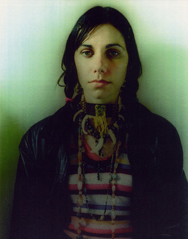
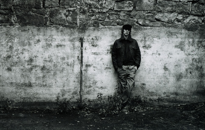
Maria Mochnacz also photographs other musicians, but PJ Harvey is the most well-known. Here are some other artists that Maria Mochnacz has worked with, so the pictures and artist images are all similar in style. Her ideas could help me think of some ideas for our magazine cover.
Vanessa Quinones
Richard Ashcroft


Maria Mochnacz also photographs other musicians, but PJ Harvey is the most well-known. Here are some other artists that Maria Mochnacz has worked with, so the pictures and artist images are all similar in style. Her ideas could help me think of some ideas for our magazine cover.
Vanessa Quinones
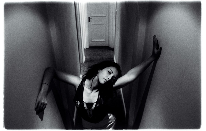 |
| This photo was taken in the artists flat - not a studio |
 |
| This was shot for Nylon magazine. |
Chikinki
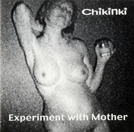 |
| Mochnacz shot a video of this artist through an analogue video night vision camera. She then played the video back on her television and took a picture of the video from the tele. |
Ana Da Silva
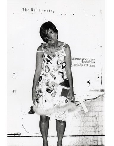 |
| Mochnacz placed a giant piece of paper behind the artist and cut out various letters in different fonts and stuck them behind to make the photograph look like something out of a magazine. Da Silva's dress is covered in all her favourite things - that would normally be kept away in a box or mantelpiece. So the pictures are all noticeably in black and white, which is the idea that my group and I are going for as well. Because our music video deals with memories and flash backs, black and white is an appropriate colour scheme I think. Particularly with Chikinki's grain look...we want that gritty feel. We'd probably be attracting a target audience of around 17-27 year olds, people who are more sophisticated with their music taste and have that typical grunge style about them. |
Monday, 26 September 2011
Research into the institutional context of PJ Harvey
Today I researched information about PJ Harvey's record deal just to have some more feedback on what her background is.
PJ Harvey


PJ Harvey
- is signed to Island Records.
Island Records was based in Jamaica as an independent music label but was bought out and is now a subsidiary company of the major, Universal.
It's quite interesting to see that Island has a mix of artists signed up. Lets see...
They've got Florence and The Machine signed up. She's a very distinctive artist. Noticeably indie, particularly how she wants to stand out with her ginger hair - as these days it's thought of as socially embarrassing to have ginger hair for some reason. But she has that mainstream look about her what with the pink lipstick and eye shadow going on. The leopard top might indicate some sort of sexual reference...she's an animal..? And her open mouth could possibly be suggestive.

Oh they've also got the band The Feeling. Ah here we go...it's the typical boy band look with the formal blazers and but they've got modern day hairstyles and one is wearing a hat...smart casual look I think. Again, another noticeably indie group yet they still have this mainstream constructed image about them. They aren't all exactly good looking - obviously their success and popularity isn't so much about their looks...

So PJ Harvey has some similarity between these artists too. She's definitely indie, we know this for sure, but maybe all this commercial success she's been getting recently like winning the Mercury Music Prize this year is increasing her fan base as she becomes more popular. Thus more demand is in for her name and she begins to cater for a more mainstream target audience.
Clever old Island. They're targeting with their artists both for mainstream and indie tastes..
Subscribe to:
Posts (Atom)


